Maps and data reimagined

Transform your data into interactive maps. Free & Open Source.

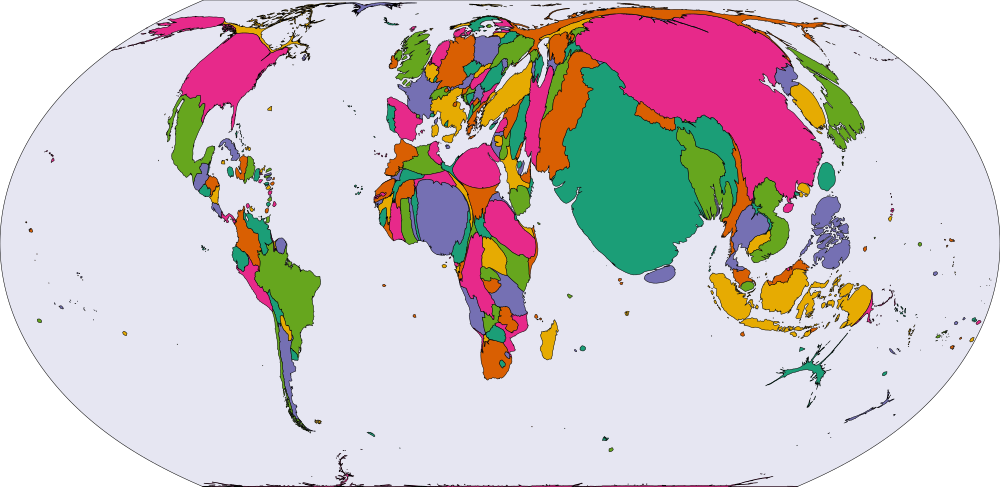
A world population cartogram*

Features

Data-Driven Visualization

Create cartograms where region sizes reflect your data values, or build choropleth maps with color-coded statistical information.

Flexible Map Formats

Upload your custom geographic data (GeoJSON/Shapefile) or choose from our library.

Custom Data Editing

Upload CSV/Excel files or use our built-in editor to quickly manage your data.

Smart Color Palettes

Topology-aware coloring ensures adjacent regions have distinct colors. Choose from preset palettes or create your own custom schemes.

Inset Maps & Labels

Better visualize specific regions with inset maps. Region labels are automatically placed and scaled according to area size for optimal readability.

Share & Embed

Export your maps as SVG or JSON files, share via direct links, or embed visualizations in websites with responsive iframe support.

Privacy Options

Use our online service for convenience, or deploy offline via Docker/CLI for complete data privacy. Your choice, your data.

Free & Open Source

Completely free to use with full source code available. Community-driven development with no hidden costs or subscriptions.

See It In Action

Feel free to explore or edit our example below.

*Region boundaries and population data for the world cartogram are sourced directly from Natural Earth which adopts boundaries based on defacto status.
**We do not adopt a political stance on boundaries provided in our library.
**Our service is provided on an 'AS IS' basis. We make no guarantees regarding the reliability or security of your data. By using this service, you acknowledge and accept that we are not liable for any data loss or other damages.